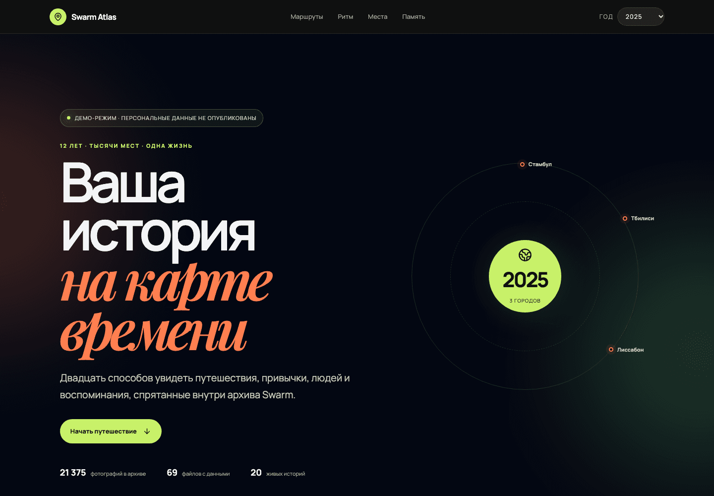
Swarm Atlas: Life on the Map of Time
Swarm Atlas is an interactive personal analytics project built around a Foursquare/Swarm data export. Instead of presenting the archive as tables or a conventional dashboard, the product turns years of check-ins, visits, photographs, places, devices, text, and social context into twenty visual stories organized around movement, rhythm, places, and memory.
Twenty analytical stories
The atlas includes a time-machine map, automatically detected travel chapters, city fingerprints, life-radius comparisons, a 168-hour activity heatmap, explorer-versus-regular balance, return cycles, place lifecycles, day replay, venue networks, life corridors, visit-duration landscapes, photo timelines, text themes, social eras, device archaeology, and an annual Swarm yearbook.
Narrative interface
A visitor selects a year and moves through a long-form visual narrative. Maps, radial charts, timelines, heatmaps, network diagrams, ranked lists, and interactive cards explain how behavior changed over time. The interface is designed as a digital atlas rather than a dense BI panel, keeping interpretation and personal meaning close to the data.
Data model and processing
The backend is prepared for imported Swarm JSON files covering check-ins, visits, venues, photos, friends, tips, comments, ratings, plans, shares, and device information. Python import tools normalize the archive into SQLite; FastAPI exposes analytical endpoints, and the React/TypeScript frontend renders the visual layers.
Privacy-first public demo
The public version uses a deterministic demonstration dataset. Real check-ins, coordinates, contacts, and photographs are not shipped with the deployment. This makes it possible to show the full product and all twenty interactions without exposing a private life archive.
Delivery
The application is built with React, TypeScript, Vite, SVG-based visualization components, FastAPI, and SQLite. Docker and Traefik provide the production delivery layer, while a health endpoint clearly reports whether the system is operating in demo or data mode.
Value
Swarm Atlas shows how a fragmented personal data export can become a meaningful visual product. It combines data engineering, privacy design, interactive infographics, and editorial storytelling to help a person rediscover patterns that a standard activity log cannot reveal.
Media Gallery